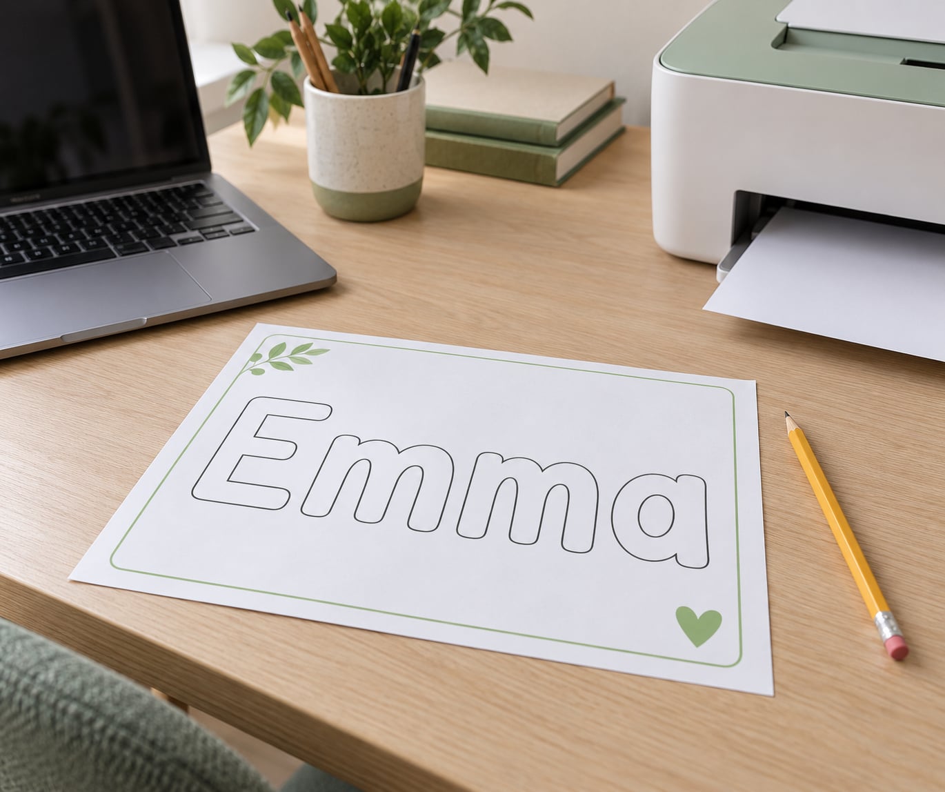
Making a printable name tracing worksheet takes about ten minutes once you know which tool to open. Type the name into an editable template or a design app, make the letters faint or hollow so a pencil can follow them, add handwriting lines underneath, and print. Free browser generators handle the whole thing in two minutes. Canva and a word processor give you more control over style and layout.
I’ve made a lot of these, mostly for classroom sets of 25 or so, and the difference between a worksheet a child finishes in five focused minutes and one they abandon after the first row is almost always the tracing style and the size of the letters. Nothing clever. Here’s the process I use.
Table of Contents
- 1What You Need
- 2Step-by-Step: How to Make a Printable Name Tracing Worksheet
- 31. Choose the Child’s Name and Skill Level
- 42. Set Up the Worksheet Layout
- 53. Add the Name in a Traceable Format
- 64. Add Practice Lines and Writing Prompts
- 75. Review, Save, and Print the Worksheet
- 8Common Mistakes and Easy Fixes
- 9Frequently Asked Questions
- 10What is the best age for a printable name tracing worksheet?
- 11Can I make a name tracing worksheet for free?
- 12Should a child trace the whole name or only the first letter?
- 13How many times should a child practice writing their name?
- 14What is the difference between tracing and copying a name?
- 15Can I use a name tracing worksheet for multiple children?
- 16Should I use dotted letters or solid outline letters?
- 17Conclusion
What You Need
The whole job needs very little. Most of it is software you either already have or can open in a browser.
- The name itself. Write it the way you want it on the page, including whether the child uses a middle initial, a hyphen, or two words.
- A printer and plain paper. 8.5 by 11 inch Letter is the North American default. A4 paper works too, but you’ll want to check the scaling so nothing runs off the edge.
- One of four tools. A free online generator, Canva, an editable PDF template opened in Adobe Acrobat, or whatever word processor you own. The next section walks through each one.
- A tracing font, if you build it yourself. A dotted primary penmanship font is the standard choice for beginners. Cursive needs a different font entirely.
- Optional extras: colored pencils, a laminating pouch and dry-erase markers if you want the page reusable, a hole punch for a binder booklet.
If you only have a phone or a tablet, generators still work because they fill the page server-side and hand you a finished PDF. The editable-PDF-template route does not, and I’ll flag that when we get there.
Step-by-Step: How to Make a Printable Name Tracing Worksheet
1. Choose the Child’s Name and Skill Level
Start by deciding who the worksheet is for, because a toddler and a first grader need completely different pages from the same template. Match the sheet to what the child can already do on their own, not to their age on paper.
- Around 2 to 3 years old: one letter at a time, very large, usually the first letter of the name only. Three or four rows, nothing else on the page.
- 3 to 4 years old: the full first name in all capital letters, dotted, with wide spacing between letters.
- Kindergarten: capital first letter with lowercase after it, plus a bottom row of blank lines for independent writing.
- First grade and beyond: the full first and last name, print style, with dotted lines on one sheet and plain lines for copying on the reverse.
If a child writes their name from memory but messily, skip straight to the copying stage. Tracing is for building letter formation, and a child who already has the shapes just needs blank lines and a model to look at.
2. Set Up the Worksheet Layout
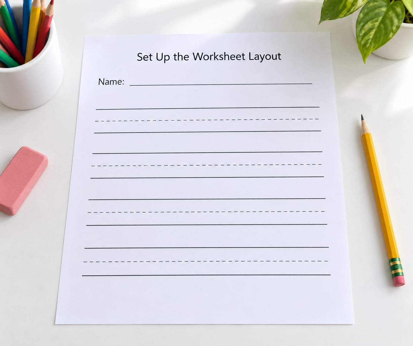
Lay out one name, then decide how many times it repeats down the page. My default is three tracing rows, one row with a faded model word at the start, and two blank rows underneath.
- Leave a 0.5 inch margin on every side so nothing gets clipped by a printer that can’t print edge to edge.
- Keep each row’s guide lines the same distance apart the whole way down. Changing spacing between rows confuses children more than the letter style does.
- Use a handwriting line set with a solid baseline, a dashed midline, and a dotted top line. That three-line setup shows position as well as shape.
- Keep one name per page in the tracing rows. Two names side by side look neat on the designer screen and fall apart in a child’s handwriting.
You can tell the layout worked when you look at it from across the room. If you can’t read the name from four feet away, the letters are too small or the lines are too tightly packed.
3. Add the Name in a Traceable Format
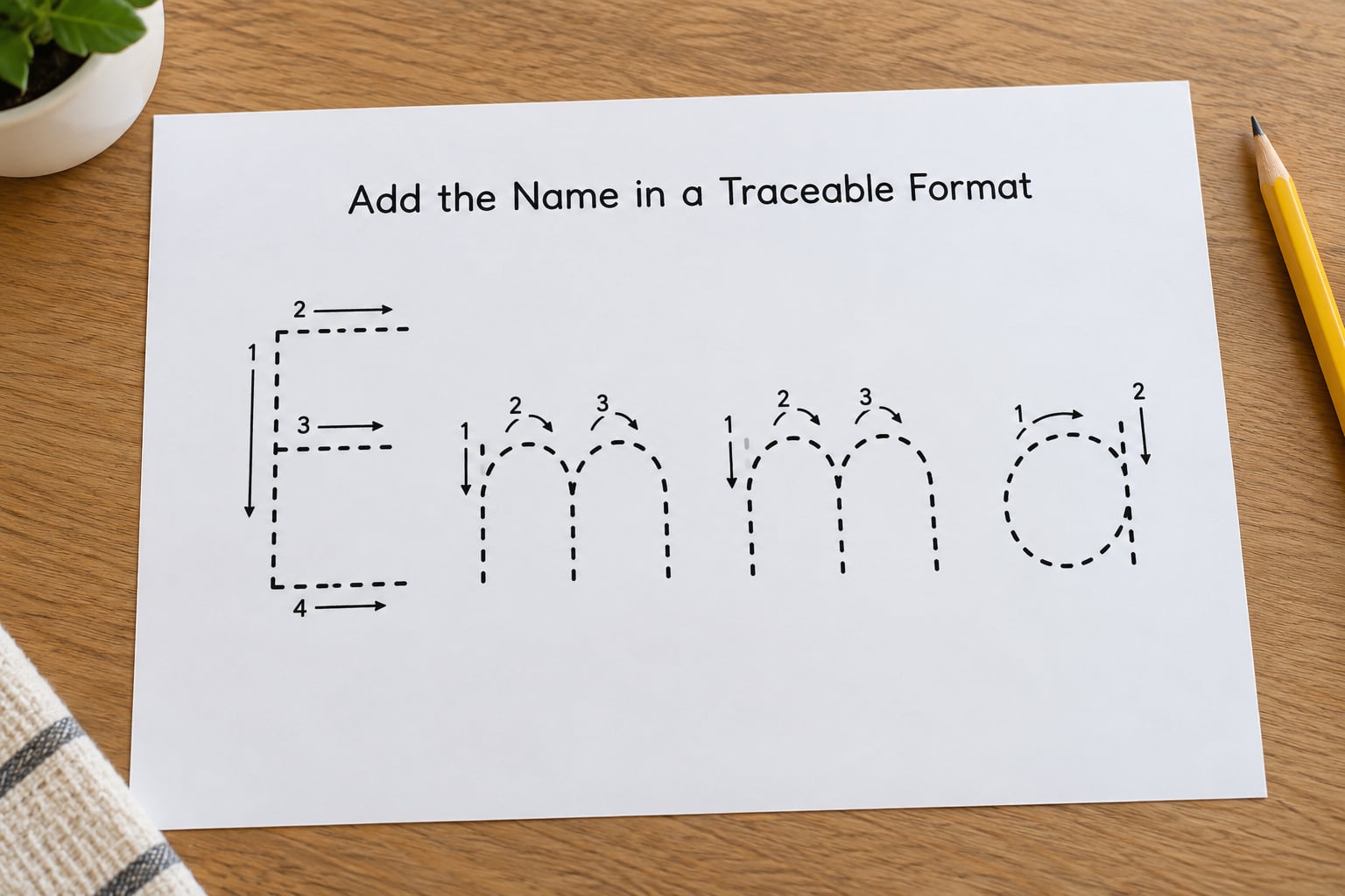
This is the part that decides whether the page works. The letters need to be light enough to trace but dark enough to see. There are four standard ways to get there.
- Dotted letters. A dotted-line font, such as the primary penmanship fonts used in most kindergarten materials. Best for first-time writers because each stroke is already broken into pieces.
- Dashed or broken letters. The same shape with a continuous stroke. Better once the child can follow a dotted letter without stopping.
- Outline letters. Hollow characters with a thin border and a white or transparent fill. This is the easiest effect to build yourself: in Canva, select the text, reduce the fill to white, and add a dark stroke outline in the same size as the letter.
- Faded model letters. Duplicate the text layer, drop the copy’s opacity to around 20 percent, nudge it very slightly, and send it behind the darker layer. That’s the trick behind most traceable text you see in design tutorials.
Add stroke-direction arrows and a start dot when the child is brand new to a letter. Two things are true at once here: a pencil with a chunky grip is easier to control than a thin one, and a letter traced with the wrong stroke direction gets memorized wrong. Arrows fix the second problem before it starts.
Keep the font boring. Rounded, single-story, evenly weighted letters with clear separation between them read best. A fancy font with loops and flourishes gives a child nothing solid to follow.
4. Add Practice Lines and Writing Prompts
Repetition does the teaching here, so add enough rows to feel like practice without turning the page into a punishment. Three traced rows plus two blank ones is plenty for one sitting. Ten rows is how you get a child who hides the sheet under the couch.
Mix the row types in this order:
- One row with the model name at full darkness, so the child sees the target shape.
- Two rows with faint traceable letters to follow.
- Two rows of handwriting lines with the name printed once at the left, for copying.
- One final row of completely blank lines for independent writing.
A short instruction line at the top helps more than it sounds. “Trace Ava three times, then write your name on your own” tells a child what finished looks like without an adult standing over them.
Add a name box in the top corner. Kids who can match their own name to their belongings learn name recognition faster than they learn letter formation, and the box costs you nothing.
5. Review, Save, and Print the Worksheet
Zoom to 100 percent and read the whole page as if you were the child. Check that every letter is visible, that nothing sits within half an inch of a paper edge, and that the faint rows are actually faint rather than invisible.
Export as PDF rather than a screenshot. A PDF keeps the page size fixed at 8.5 by 11 inch, so it will not reflow or squish when you print it. Save a copy with the child’s name in the filename so you can find it again in six months.
Before printing a full class set, print one copy as a test. Look at three things: whether the rows line up with the guide lines, whether the faint letters are visible on your printer, and whether the margins held.
Two printing problems come up constantly. Grayscale printers render light gray dots almost invisible, so drop the faint letters one step darker before you reprint. And on A4 paper, choose “fit to page” rather than “actual size” or the bottom row will drop off.
If you want it reusable, slide the sheet into a laminating pouch and hand over a dry-erase marker. Wipe it clean at the end of the week and it becomes the same worksheet for the next one.
Common Mistakes and Easy Fixes
Almost every bad worksheet I have printed came down to one of the same handful of problems.
- Letters too small. The default page size in most design tools assumes an adult reader. Set the name to fill about two-thirds of the line width and never smaller.
- Faint rows printed invisible. Black and grayscale printers lose light grays. Use medium gray rather than pale gray, or switch the traceable letters to an outline style with a solid border.
- Too much on one page. Three names plus a coloring activity plus a cut-and-paste section turns writing practice into busywork. One focus per page.
- Too many rows. Repetition past about six rows produces sloppy letters and a bored child. Print a second sheet instead of crowding the first.
- Centered lines or uneven spacing. Rows with inconsistent line spacing break the muscle memory you are trying to build. Align everything to the same baseline grid.
- Hardness set too high. If a three-year-old is struggling with the letter M, the worksheet is too difficult, not the child. Drop back to the first letter of the name only.
- Tracing when copying is the right stage. If a child can already write their name untidy but correctly, dotted letters are unnecessary. Give them a solid model and blank lines.
- Skipping the test print. One test page costs thirty seconds and saves a ream of paper and an afternoon.
One more worth naming: a child who hates tracing is usually being asked to repeat a movement they cannot yet control. Before the pencil comes out, five minutes of play-dough or a salt tray for that letter usually fixes more than any amount of extra printing.
Frequently Asked Questions
What is the best age for a printable name tracing worksheet?
Most children are ready somewhere between three and four, when they can hold a pencil with a relaxed grip and produce a recognizable circle and line. Start earlier if you use one letter at a time rather than the whole name. Below three, hands-on activities like play-dough letter shapes and name songs tend to help more than anything on paper.
Can I make a name tracing worksheet for free?
Yes. Most free online generators produce a finished, printable PDF at no cost, and Canva’s free tier has everything you need for the outline or faded-layer technique. A word processor is also free. You only pay if you want decorative clip art, custom fonts, or a packet template sold as a paid bundle.
Should a child trace the whole name or only the first letter?
Trace only the first letter until the child forms it reliably on their own, then add the rest of the name. Jumping straight to a full name on day one usually ends with two wobbly letters and frustration. Once the letters are secure, trace the full first name and finish with a blank line for independent writing.
How many times should a child practice writing their name?
Short and often beats long and rare. Five to ten focused minutes, three or four times a week, is more useful than twenty minutes once a week. Stop while the child is still finishing successfully rather than pushing through the frustration, and let the final row of every sheet be written without tracing at all.
What is the difference between tracing and copying a name?
Tracing means following a faint or outlined version of the letters with your pencil on top of them. Copying means writing the name next to a solid model, using it as a reference but making the letters yourself. Tracing builds letter formation; copying builds recall and independence. Most worksheets include both on the same page.
Can I use a name tracing worksheet for multiple children?
Yes, and it is the fastest classroom use of one. Type the class list once into a generator that supports batch entry and every child gets a page with their own name on it. Print single-sided unless you want the practice showing through, and laminate or hole-punch the pages into individual booklets.
Should I use dotted letters or solid outline letters?
Use dotted letters with a beginner and outline letters with a child who has letter formation under control. Dotted strokes break each letter into manageable pieces, which helps early writers. Outline letters reward a smooth continuous stroke and keep the page from looking too busy for an older child or an older kindergartener.
Conclusion
Start with the child’s name written the way you want it seen, pick a tracing style that matches what they can already do, and print one test sheet before making a full set. If you’re making this for a whole class, type the list into a free generator and batch the pages. If it’s for one child, build it in Canva and keep the letters big.